
Molly Williams comes by her decorating talents honestly. “My mom was an interior designer, so I grew up watching her redo homes,” she says. But when Williams first moved to Charlotte, she wasn’t sure where her passion for design would land her. A part-time job in real estate led to one staging homes—a gig that introduced her to her now husband, Charlie, and eventually prompted her to launch an interior styling and staging business, Modish Company.
:max_bytes(150000):strip_icc():format(webp)/27374_M.Williams_NC_11043552-2f8e424b95ee471a9eac2f434e9d59fc.jpg)
Brie Williams
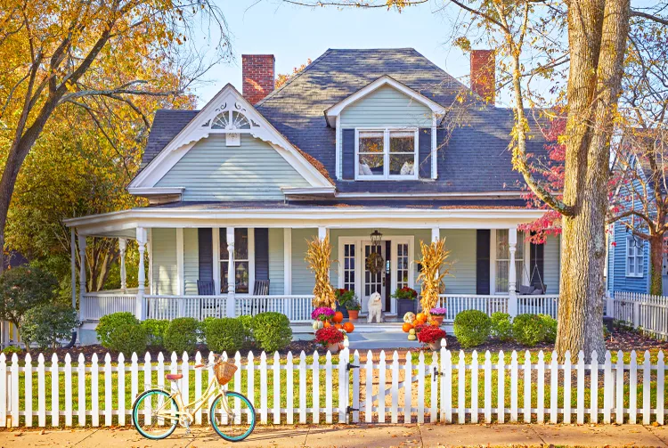
Before getting married, the two began searching for a place of their own. They wanted something historic that they could infuse with their own style. “When we found this one, I immediately fell in love with it,” says Williams. “I grew up in Virginia in a 300-year-old house in the countryside, and my parents are huge antiques collectors. I’m heavily influenced by that.” The architectural details, like original moldings and framed windows and doors, initially sold her on the house, but she also fell for its unassuming, bungalow-like exterior—which makes the 12-foot-high ceilings inside feel like a grand surprise.
Aside from a few smaller-scale renovations, the pair relied heavily on paint—and teamwork—to pull off the update. One of Williams’ favorite additions is the picket fence Charlie built, which allows their dog, Harry, to roam. “It’s been a labor of love, but it’s been fun to gradually make decisions and collaborate on a place that’s evolved with us,” says Williams, who now has two young children, Winnie and Gus. “A house isn’t a home to me unless it has unique, old pieces or items that seem collected. But there’s nothing so valuable that we don’t feel like we can enjoy it.” See how they brought soulful and modern touches to the historic abode.
:max_bytes(150000):strip_icc():format(webp)/27374_M.Williams_NC_11033191-2f073a62976d4fe5aa64c271395367ad.jpg)
Williams leaned into the home’s past to design the dining room. Inspired by Williamsburg, she wrapped a mural around the space. “I like that this one [from Anewall] is an abstract, modern interpretation of a classical oil-painted version,” she says. Storied pieces also sit center stage here. A chandelier original to the home floats above an antique dining set made by Thos. Moser, while a thrifted portrait from 1875 is displayed in her grandfather’s frame over the mantel.
:max_bytes(150000):strip_icc():format(webp)/27374_M.Williams_NC_11033226-e79e1b8e263748c184e835529c920bca.jpg)
Brie Williams
For the young family of four, it was important that the whole house felt comfortable. “There’s definitely a mix of high and low,” says Williams. Here, that meant a corner cabinet full of priceless heirlooms as well as inexpensive French linen curtains from Overstock—which, ironically, is the element she gets asked about most. A Serena & Lily fixture overhead and a lamp that’s made from an antique surveyor’s tripod topped with a $10 1960s shade both offer a warm glow. Practicality also governed some of the furnishings, such as the jelly cabinet they added to store things out of sight. “Since we have children, a big question at our house is, ‘Where can we put all the toys?’ ” she says.
:max_bytes(150000):strip_icc():format(webp)/27374_M.Williams_NC_11033331-776276e4e8504b54b93b67a7ff91b097.jpg)
Brie Williams
Because there’s no hall closet, Williams selected a dresser for storage. She wrapped the foyer in a Schumacher grass cloth. “I looked for something that provided a nice transition between rooms since it’s a spot that connects all the common areas downstairs,” she explains.
:max_bytes(150000):strip_icc():format(webp)/27374_M.Williams_NC_11033114-d75817e600594322b91f0e1eeb35e39e.jpg)
Brie Williams
“I love how sunny it is,” Williams says of the compact kitchen, which got a few cosmetic updates. They revamped the cabinetry with a fresh coat of Sherwin-Williams’ Extra White (SW 7006) and real brass hardware. To keep costs down, they left the existing countertops and Charlie replaced the backsplash himself. The couple introduced pattern with Magnolia’s French Ticking Wallpaper and added bamboo blinds to allow natural light to filter in.:max_bytes(150000):strip_icc():format(webp)/27374_M.Williams_NC_11043589-09a6535ecba4447dbd0fe3f393ec5780.jpg)
Brie Williams
Guests are bound to feel immediately at ease in a suite that’s lovingly layered with family pieces and collected antiques. The side table was a fixture in Williams’ childhood home, and the canopy bed belonged to her parents when they first wed. “We’re making the hand-me-downs work for us,” she says.
:max_bytes(150000):strip_icc():format(webp)/27374_M.Williams_NC_11033375-8794530157b04f7f85ce6a4916f81f8c.jpg)
Brie Williams
They took the heaviest hand with the primary bath, gutting it to better fit their needs. “I didn’t want to take away from its brightness, so we added louvered shutters to provide privacy but still allow light in,” says Williams. She chose an 18th-century pedestal table to root the renovated room in history. “We picked something that suited the age of the house so it didn’t feel too new,” she says.
:max_bytes(150000):strip_icc():format(webp)/27374_M.Williams_NC_11043791-f4a926bd490e4919bf8a7ad90aa4f6bd.jpg)
Brie Williams
The primary bedroom reflects plenty of natural light thanks to Sherwin-Williams’ Pearly White paint on the walls and Extra White on the trim.


